The Last Echo has several progression screens, but they are easier to understand when treated as one connected loop. This reference explains what each screen is for, what information it exposes, and what a player can learn from it. It is written from the current game build and the original captures in the gameplay gallery; it is not a promise that future balance updates will use the same numbers or layout.
The play loop: prepare, advance, inspect
The central loop has three kinds of work. The game performs repeated execution through auto-battle and offline progress. The player provides judgment by choosing equipment, abilities, upgrades, and activities. Results then provide the evidence for the next decision. Keeping those responsibilities separate is useful because a larger number is not automatically an explanation of why a build improved.
- Prepare. Start at the home hub and review the Gear, Ability, and Upgrade screens. Fill missing equipment slots, compare a replacement with the item it would remove, and spend resources only when the intended effect is clear.
- Advance. Let the party work through a stage and watch the visible DPS and Gold-per-minute indicators. A stable stage is a better offline starting point than a stage that only succeeds once in a while.
- Inspect the return. When you come back, the Welcome Back panel reports elapsed time, collected resources, and AFK boxes. Collect those rewards, then check whether the stage and build still match the goal you had before leaving.
- Test one change. Use a dungeon or world-boss attempt as a repeatable comparison. Change one meaningful variable, run the test again, and keep the change only if it solves the problem you were trying to solve.
Screen map
The bottom navigation groups the game's major decisions. The table below is a quick way to choose where to look instead of opening every menu at random.
| Screen | What it answers | Useful next action |
|---|---|---|
| Home / stage | Is the current party advancing, and at what DPS and Gold rate? | Watch a full encounter before changing the build. |
| Gear | Which item is equipped, what is in the inventory, and how do the statistics change? | Compare one replacement, then equip or lock it. |
| Ability | Which active or passive effect can address the current failure? | Choose damage, survival, or consistency based on evidence. |
| Upgrade | Which permanent or hero investment is available now? | Spend resources where the next test can show a clear result. |
| Dungeon | Which resource, trial, attempts, and difficulty are available? | Use the activity whose reward helps the build you are testing. |
| Summon | What pool, cost, possible rewards, odds, and guarantee apply to this banner? | Read the active banner before confirming a pull. |
| Settings | Can the controls, motion, contrast, audio, or account settings fit the player? | Set accessibility options before a long session. |
Offline rewards: the return screen is a checkpoint
Offline progress is designed to handle routine battles while the player is away. The Welcome Back screen does more than show a single currency total: it reports how long the account was away, separates Gold and Harpenny, and lists the AFK boxes that were earned during that period. The support FAQ documents a current 24-hour offline cap, so leaving the app closed for longer does not mean the reward calculation grows without limit.
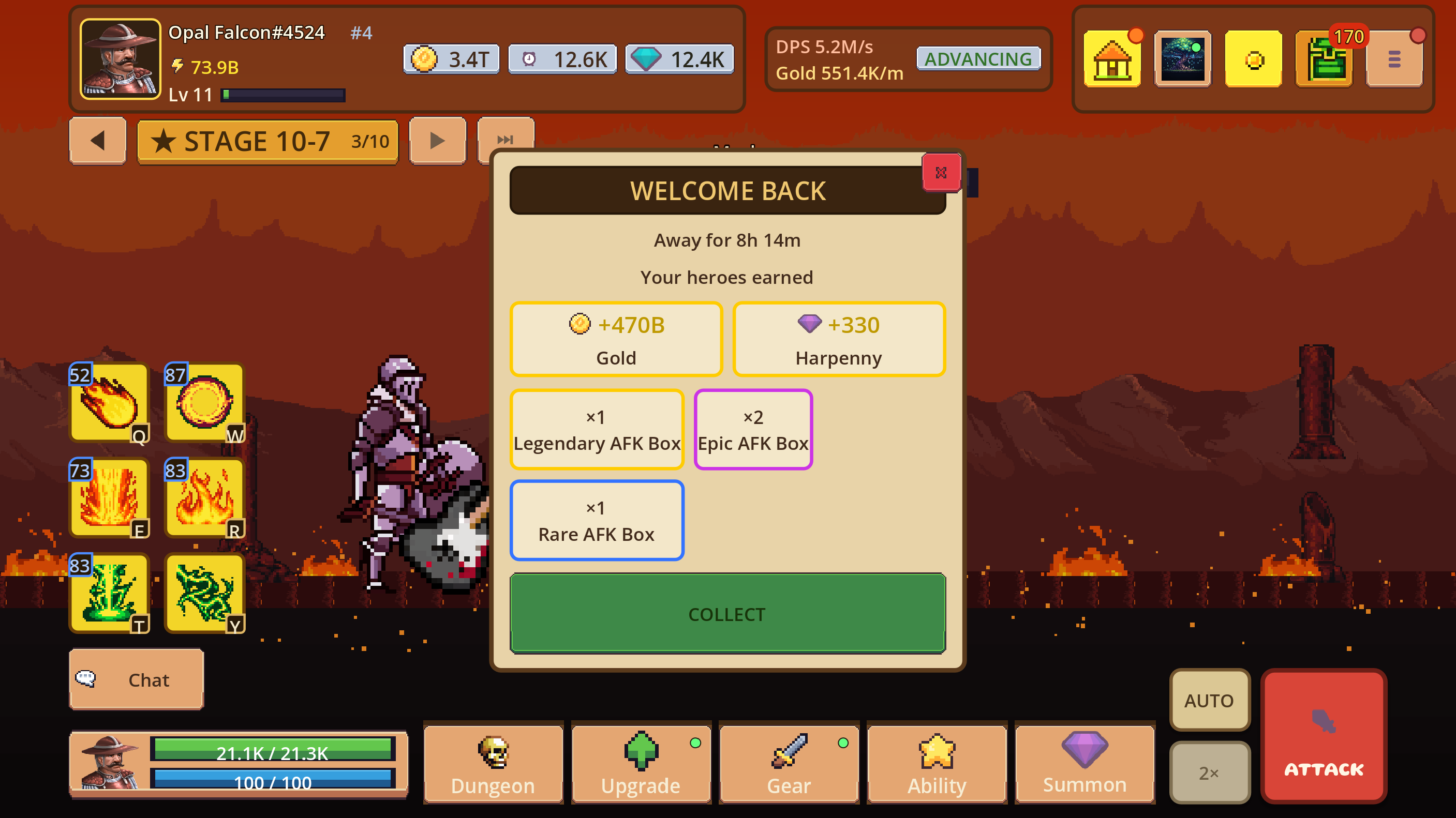
In this original capture, the return summary shows 8h 14m away, +470B Gold, +330 Harpenny, one Legendary AFK Box, two Epic AFK Boxes, and one Rare AFK Box. Those values are an example of one account state, not a universal drop promise.
A good return routine is simple: collect the summary, open the relevant boxes, check the current stage, and then decide whether the new items solve a real bottleneck. Offline rewards provide materials and options; they do not decide which equipment or ability combination is best for the next encounter.
Equipment: compare a change before committing
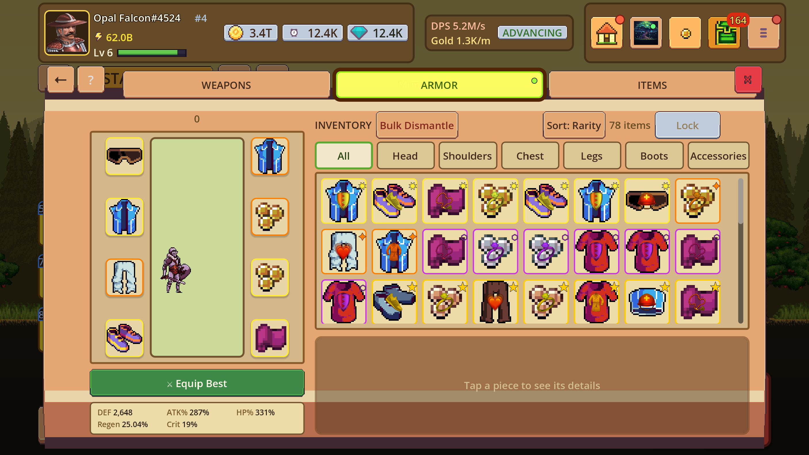
The Gear screen keeps the paper-doll, inventory, and character statistics close together. In the captured build, armor can be filtered by All, Head, Shoulders, Chest, Legs, Boots, or Accessories; the list can be sorted by rarity, items can be locked, and bulk dismantling is available. Those controls make inventory maintenance faster, but the comparison panel is what makes a build decision understandable.
| If you notice... | Try this question |
|---|---|
| The party loses early | Does the replacement improve defence, health, or regeneration enough to survive the failure point? |
| The party survives but stalls | Does the item increase damage or improve the ability interaction that is slowing the run? |
| Results vary from run to run | Would a slightly less explosive item produce a more reliable result? |
| The inventory is filling up | Lock anything you are testing, compare before dismantling, and use the filters to reduce noise. |
Dungeons: make limited attempts comparable
Dungeons are a useful bridge between routine stages and build tests. The current Resource view shows separate activities such as Cave of Echoes, Sunken Temple, and Frozen Vault, along with their reward type, key cost, and remaining attempts. Difficulty is presented as a progression: the captured screen shows Normal available while Hard and Hell remain locked until the preceding difficulty is cleared.
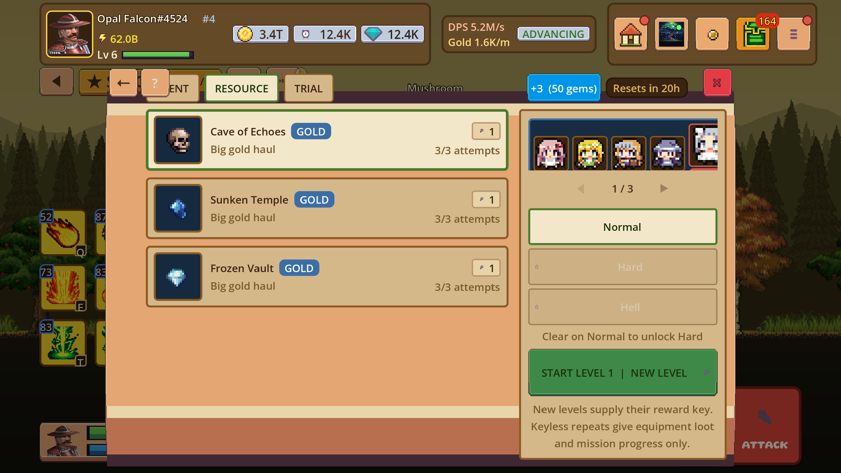
The screen also explains an important distinction: new levels supply a reward key, while keyless repeats give equipment loot and mission progress only. That makes a dungeon run a resource decision, not just a button to press whenever it is available. Before starting, choose the activity whose reward answers the current need, confirm the difficulty, and reserve attempts for a build you are actually evaluating.
Summons: read each banner at the point of choice
Randomized rewards are easiest to understand when the banner itself is treated as the source of truth. Check the active tab, the featured item, the pool and tiers, the cost, and any guarantee or pity text before you spend currency. The current public Terms list the standard ability-pull probabilities and the hard-pity rules, while the in-game banner remains authoritative when a particular event uses different details.
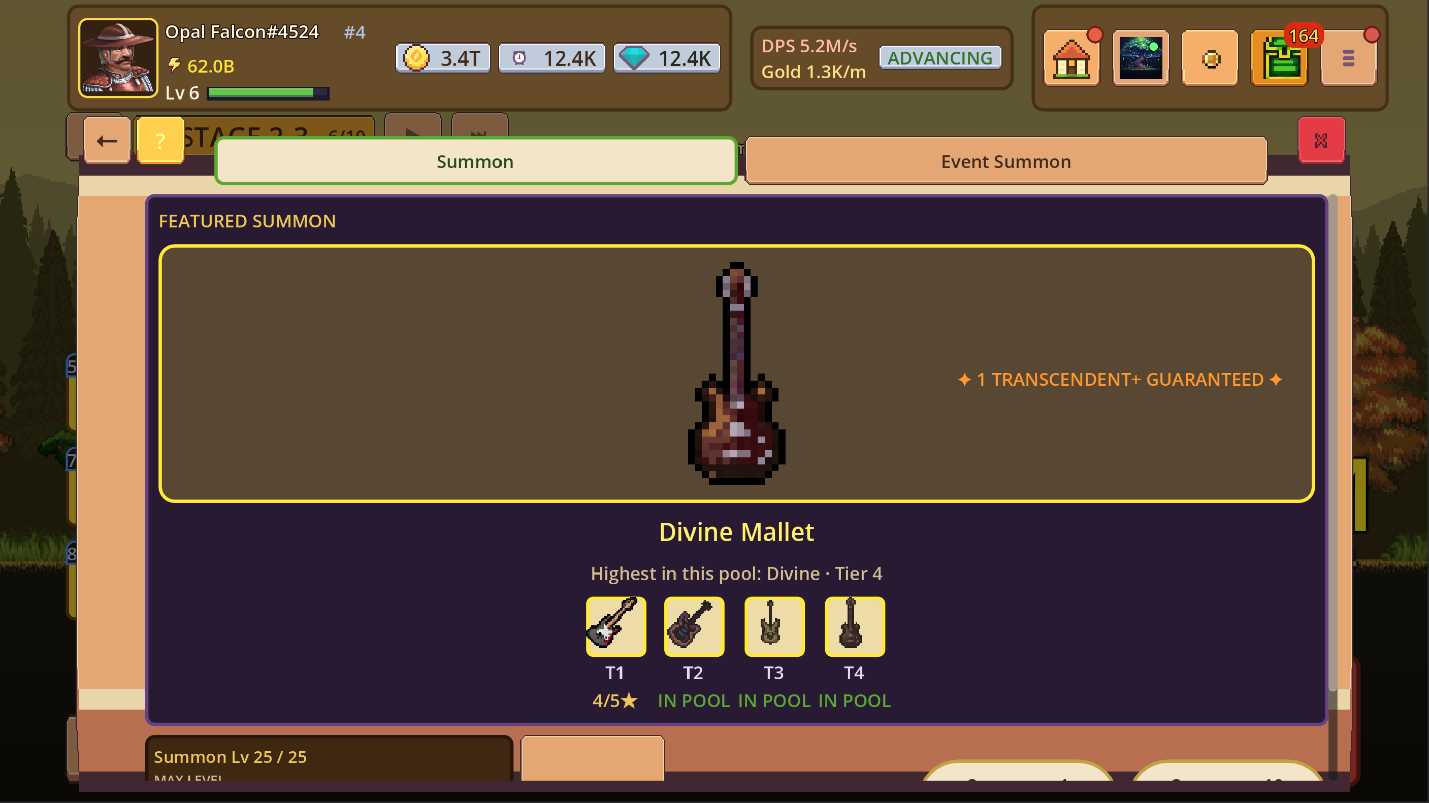
The capture illustrates why banner-specific reading matters: it names a Featured Summon, identifies Divine Mallet, shows the highest tier in the pool, and includes a guarantee message. Those are decision details, not decorative copy. If the displayed odds, pity counter, or result appears inconsistent, save the screen and report the app version and device via support.
Accessibility settings are part of the build
The game exposes accessibility controls alongside general, audio, gameplay, account, privacy, and developer settings. In the current screen, Colorblind Mode adds shape cues to rarity indicators, Reduce Motion cuts screen shake and parallax drift, Reduce Flashing dims bright flashes and strobes, High Contrast Mode strengthens borders and text, Movement Keys changes where on-screen controls appear, and UI Size provides a separate way to adjust readability.
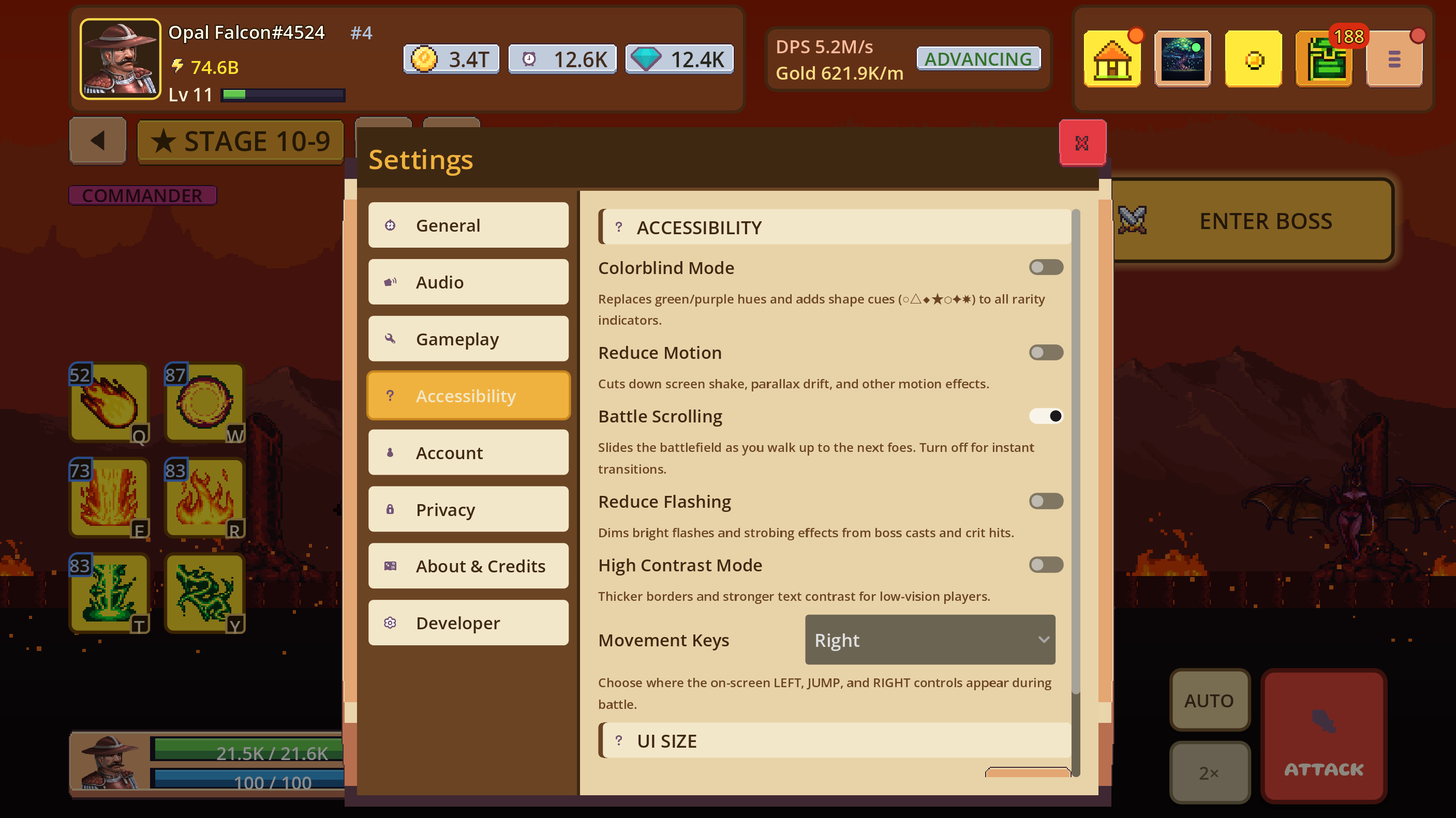
These options are useful before a difficult session, not only after a problem occurs. If flashing, motion, small text, or control placement makes a screen tiring to use, adjust the setting first and then judge the game system. A setting that makes information easier to read is part of a better build experience.
A practical decision loop
When progress slows, use this short loop to turn a vague feeling into a testable change:
- Name the failure point. Early defeat, a damage stall, or inconsistent results each suggests a different fix.
- Choose one screen. Gear, Ability, Upgrade, Dungeon, or Summon should each answer a different question.
- Change one variable. Replacing every item and spending every currency at once hides the cause of an improvement.
- Repeat the same test. Use the same stage, dungeon difficulty, or world-boss attempt when possible.
- Record what worked. Keep the change if it improves the intended result; otherwise revert and test a different hypothesis.
How this reference stays accurate
This page is maintained by the development team and separates current screen behavior from future plans. Screenshots are original captures from the App Store build, and example reward values are labeled as examples rather than presented as universal rates. When a UI or rule changes, we update the affected explanation and the revision date.